2. Getting Started
2.1. Introduction
GUI Composer allows you to create custom rich GUI applications that can run online or on the desktop. Create your app once and deploy online and/or desktop (OSX, Linux, Windows). Desktop applications can be run standalone or added to CCS Desktop to augment CCS Desktop features.
The GUI Composer provides a simple drag-and-drop method of constructing applications. Bind your widgets to various types of data sources depending on your application. GC is available at dev.ti.com/gc
The Gallery provides the ability to share applications online publicly, with a group or privately. Publicly accessible applications can be used as starting point examples for your own custom apps.
The GUI Composer Runtime provides necessary components to allow running GUI Composer applications on desktop PC.
Check out the Tutorials section for step-by-step examples of how to build cool dashboards and applications that make it easy and fun to interact with your embedded designs. Check out our FAQ page for common questions and answers.
2.2. GUI Composer in 1 Minute
2.2.1. Preparation
Here’s what you need to run GUI Composer:
The latest version of the Chrome web browser
A myTI account for accessing CCS Cloud and GUI Composer
2.2.2. Quick Dashboard
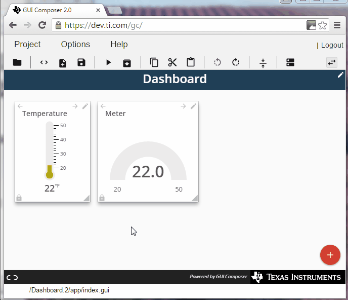
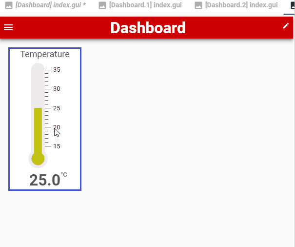
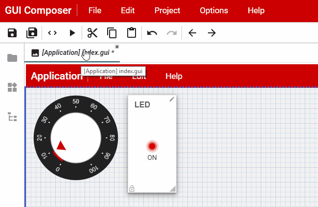
GUI Composer is a suite of tools that allows you to build HTML web pages graphically, like this:
Go to GUI Composer. You may need to login using your myTI credentials. At the GUI Composer landing page, click CREATE A NEW PROJECT to open the New Project Wizard. Select Dashboard template, click
Autofilland select your Target Communication option. The following steps are based on IBM IoT Quickstart tutorial.Add a component to your design
Configure the component’s properties. You can bind a component property to a value that is sent to or received from your target-device via JSON-formatted strings. This allows the component to either graphically display the value of what your target device has sent, or send commands to the target-device in response to user input.
Click the
 button in the toolbar to preview your new
application! Your application can be viewed on smart phones or
tablets as well as in your computer’s web browser. We recommend using
the latest version of Chrome for best results. Firefox and Safari are
also supported browsers.
button in the toolbar to preview your new
application! Your application can be viewed on smart phones or
tablets as well as in your computer’s web browser. We recommend using
the latest version of Chrome for best results. Firefox and Safari are
also supported browsers.
And there’s so much more!
2.3. What do you want to build?
There are multiple project templates to choose from. Majority of project templates are based on v2 component library. Only Application v3 template is based on v3 component library.
Dashboard: (v2)
Best choice for controlling a target device and displaying data sent from the device. Displays well on smart phones or tablets as well as PCs or Macs. Fastest way to build an application
Application: (v2)
Best choice for complex applications that need menus or have a lot of options. Allows you to position widgets exactly the way you want to.
Project Zero Template: (v2)
This example is an easy starting point for developing your own Bluetooth® Smart application with a bluetooth compatible Launchpad.
The instructions for this project are found here..
Empty Project: (v2)
A blank project template that is intended for experts who want complete flexibility in their design.
The tutorial for this template shows how to:
Build your own menu bar
Display the value of your target device’s global variables
Display x/y/z coordinates from a gyro or accelerometer
Application v3:
Best choice for complex applications with a pre-defined tab navigation pages for Getting Started, Information, Data and Documentation sections. Individual tab panels are configured by default with flex based layout. The type of layout (flex vs absolute) can be configured on a number of container widgets such as container, tab panel and dialog. You may adjust the layout scheme through Styles panel on the right hand side of GC Designer.
This is only new project template that can be used to create projects with GC Component library v3.
2.4. More Features
Choose from a number of target communication options
Please note that target communication configuration is quite different between v2 and v3 based project templates. In v2 based projects, you may configure target communication in New Project Wizard by clicking on Next button to advance to target programming and then target communication wizard pages. However, in v3 based projects, you will not be able to advance to target programming or target communication configuration. You will need to click Ok to dismiss New Project Wizard on first page and configure target programming and target communication by dragging and dropping components. In v2 projects you may modify target communication from Project > properties menu. In both v2 and v3 projects you may combine multiple communication methods in a single application to use multiple data sources in a single GUI.
Configure tons of style settings and properties
Click the  button on the right side column to open up the
properties pane. Click the
button on the right side column to open up the
properties pane. Click the  button on the right side column
to open the styles pane.
button on the right side column
to open the styles pane.
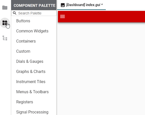
Select from a wide variety of components
With the  Component Palette, you can either browse for
components or search for them. Right click on the created component to
access the component help and properties.
Component Palette, you can either browse for
components or search for them. Right click on the created component to
access the component help and properties.

Use Javascript
A Code editor is built in - you can use it for advanced changes like custom event handling, data pre-processing, etc.
Debug your code using your Web Browser’s built-in debugger
When running your app in the Chrome browser, hit Ctrl-Shift-I to open up the Chrome debugger.