4.3. Adding Components
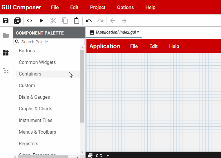
To start, click the  component palette button found on the
left side column.
component palette button found on the
left side column.
Please note that component palette is different between v2 and v3 based projects. At this point the only way to select a component library is by creating an new project and choosing appropariate project template.
Select the component you want, then simply drag and drop it to the
centre to initialize the component. 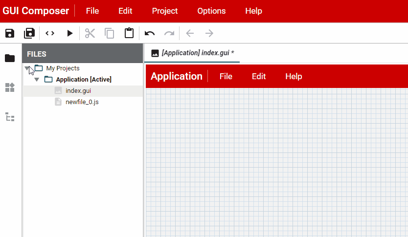
Click the  button to open up the Properties Pane. You can
right click on a created component then select Show Properties
to open the property options for the selected tile.
button to open up the Properties Pane. You can
right click on a created component then select Show Properties
to open the property options for the selected tile.
Click on the  button to open up the Styles Pane. You can left
click on a created component to open the style options for the
selected tile.
button to open up the Styles Pane. You can left
click on a created component to open the style options for the
selected tile.
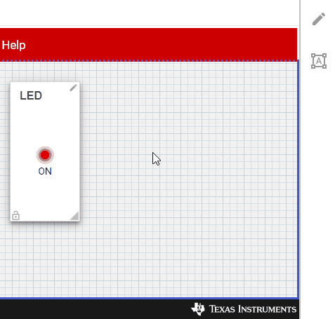
4.3.1. Adding Components to a Container component or Empty Tile
Some components can act as “containers” for other components. Other components can be dragged on top of the container in order to have the container act as a “host” for them.
For example, to create a menu bar for your application, do the following:
Drag the TI Menus / Menu Bar onto your design and position it at the top of your screen
Drag on the TI Menus / File Menu item onto the menu bar to add it to the menu bar
Add your own custom actions to the File Menu by dragging the TI Menus / Menu Action onto the File Menu item
Repeat for the Edit Menu and Help Menu
4.3.2. Component Help
To find out more about what the various properties, attributes and events that a component has, right click on the component in the palette. The following context menu will be displayed:
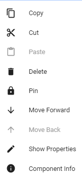
Fig. 4.2 contextmenu
A complete index of available components is available by selecting Help → Component Help… from the menu bar. This provides clickable icons for each component that allows you to view component info, the demo for the component and open the folder for the component in Windows Explorer.
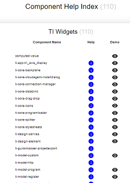
Fig. 4.3 help
Help displays help about the component’s properties and events.
Demo opens a new window that runs a demonstration of the component in action
id based component selection in tree view
To select a component in your design so that you can modify its
properties or style attributes, you can either click on the component in
the design editor or, click on the  project outline button on the
left column and select your component from the list of components
currently in your design.
project outline button on the
left column and select your component from the list of components
currently in your design.
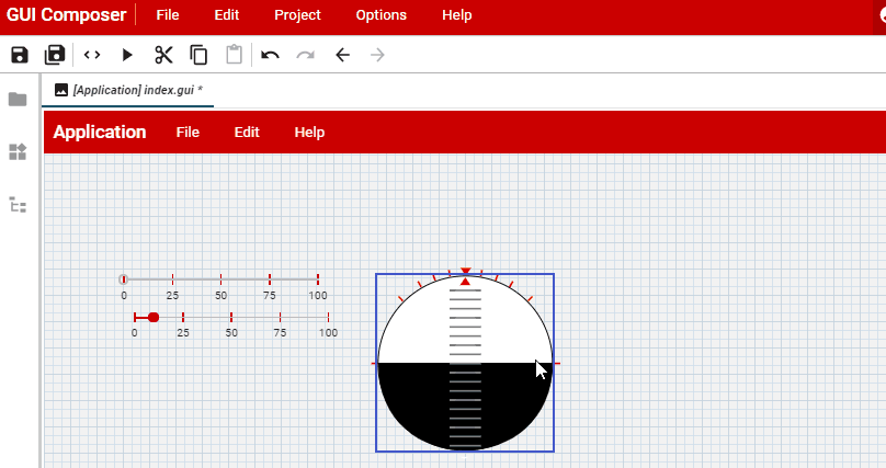
Fig. 4.4 selection
The tree view shows the z-order arrangement of your components, with the ones at the top being the furthest back. You can click on a component in the tree and right-click to move it back or forwards in the design.
4.3.3. Properties of a Component
Configure the component’s properties. You can bind a component property to a value that is sent to or received from your target-device via JSON-formatted strings or global variables when using XDS. This allows the component to either graphically display the value of what your target device has sent, or send commands to the target-device in response to user input.
Binding a widget to a property can be accomplished by selecting the
widget in your design canvas, then opening its property page (if it is
not visible) and clicking  chainlink icon beside “value” property,
then select the data source from the drop down and enter the named
object. The specific entry will depend on selected transport / protocol
combination. e.g. JSON based protocol expects a struct like syntax based
on your JSON object. JTAG protocols will require global variable name
from your targets program.
chainlink icon beside “value” property,
then select the data source from the drop down and enter the named
object. The specific entry will depend on selected transport / protocol
combination. e.g. JSON based protocol expects a struct like syntax based
on your JSON object. JTAG protocols will require global variable name
from your targets program.
Data source is equivalent to a transport / protocol combination. These
combinations may be added during new project creation. If only one
transport/protocol is added then GUI Composer will automatically select
that data source when user clicks on chainlink icon to add a
binding. However, if more than one data source is specified, then user
may need to explicitly select desired source when binding to widgets
4.3.4. Working with Binding
This link button is not selected, which means that the property
value is taken from the values entered in manually into the property’s
value field
 This link button is selected, which means that the property
value is bound to the value of another component or transport/protocols
data source property. The drop-down list to the left of the property’s
value field allows you to select which component this is bound to.
This link button is selected, which means that the property
value is bound to the value of another component or transport/protocols
data source property. The drop-down list to the left of the property’s
value field allows you to select which component this is bound to.
You can bind a component’s property either to the property of another component, or to a target-side property (sent via selected transport/protocol combination configured in Target Communication page)
4.3.5. Component Styles
Click on the styles button to switch the top panel to the
Styles view.
Some things to try:
Change the width of the selected component to go to the width of the container it is in by entering 100% into the width field
Set the width to a specific number of pixels by entering in e.g. 200px into the width field
Calculate the width, height, top, left, etc. using “calc” e.g. left: calc(50% - 20px) will center a 40px wide widget. Note that there must be spaces between each token in the CALC parameter list
Change the background color by clicking on the color underneath “bg color” and selecting a color from the color-picker pop-up
Change the opacity of the background by modifying the opacity slider position
Round the corners of a container or widget by specifying a border-radius. e.g. 10px, or 50% to make it round or oval.
Add a border by entering in the style attributes into the “border” field. e.g. solid blue 1px will display a blue border around the component.
Padding and margin values are typically entered in pixels e.g. 15px
Click the
 icon in the toolbar to show the ‘Tag Editor’. This
shows you your project’s ‘gist’ - i.e. the html tags that have been
inserted into your design.
icon in the toolbar to show the ‘Tag Editor’. This
shows you your project’s ‘gist’ - i.e. the html tags that have been
inserted into your design.Expand the Styles tag to show the CSS style entries:
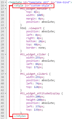
Fig. 4.5 components-giststyles
The properties for the selected component are listed under it’s id tag,
which can be determined by looking at the id field in the property
view
Note: when editing fields with suffixes such as px, you need to position the cursor at the start of the field first.
4.3.5.1. Component Themes
Themes are used to control the look of your components.
To preview the themes that are available, in the top menu bar select Project -> Design Theme.
The currently active GUI Theme is displayed with a check beside it:
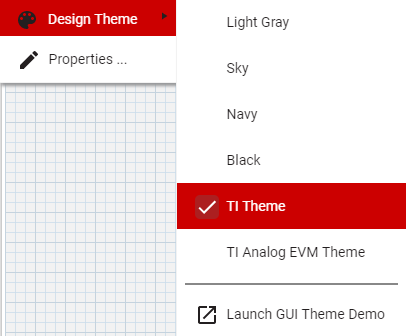
Clicking on the GUI Theme menu item opens up a demo page that shows instances of the paper widgets and ti-widgets as they are rendered using the selected theme. - At the top of the demo, you can select the current theme from the available themes via a drop-down list. - Selecting the theme will affect the preview, run and debug views of your project.
In order to apply the theme for use within the designer canvas you will need to restart the designer
4.3.6. Icons
A wide variety of SVG icons are available for use in your application. To browse the available icons, select Help → Browse Icons. To use an icon in, for example, an Icon Button:
Drag an Icon Button widget onto your design (The Icon Button is in the Component Palette)
With the Icon button selected, click on the Properties tab (in the upper right of the designer)
Scroll down to the Icon field
Replace the default icon name (menu) with the name of the icon you wish to use (e.g. add-circle)
Note: Currently, only icons in the Default Set can be easily used in your project. The other icon sets can be used within a component by prefix the icon name with the icon set ID and a colon, and importing the icon set’s html file (in the core-icons folder).
4.3.7. Videos and Images
YouTube Videos
Your application may be enhanced by adding YouTube videos or images to help communicate benefits of your solution. Videos may be used to demonstrate entire sequence of steps on how to use your application.
Open the !(images/icons/compalette.png) Component Palette, find the YouTube widget and drag it to your application.
In the property page, find “video-id” property and set it to the video id
The easiest way to find video id is to play a particular video in a browser on YouTube page and identify the ID by looking at the URL. e.g https://www.youtube.com/watch?v=Ppm8tSV7krQ . In this case the video ID is after watch?v= argument, thus our video ID is Ppm8tSV7krQ.
Images
Images may be used to demonstrate setup information, pictures of hardware or used as background to make your application more visually appealing.
Add an image to your project by opening the !(images/icons/compalette.png) Component Palette.
Currently opened/active project is shown in bold font. You may right click on project folder and choose Add File. Choose an image file from you local file system and click Open.
You may also create a folder in your project and upload images to that folder.
Drag an Image widget onto your design in the Component palette under the Common Widgets category, or you can search for it in the Palette search box.
With the Image widget selected, click on the Properties tab (in the upper right of the designer, if not already opened) Scroll down to the image-path field and set it to the filename of your image. Don’t forget to add folder name if you have created a folder to store your images.
Your image should now appear in your GUI. You may resize your image now if necessary.
If the image widget does not appear in your design until an image is set. If image widget selection is changed, then the best way to reselect that widget is by switching to “Tree” tab on properties page and navigating HTML tag hierarchy to select it. Properties associated with that widget will then appear in Properties page.