4.1. Projects
4.1.1. Welcome Dialog
When you first start GUI Composer Designer, a Welcome dialog is displayed that allows you to create a new project.
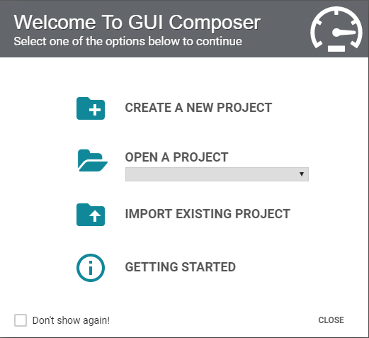
If you have created a project beforehand on the same browser, the next time you open GUI Composer the Welcome dialog will include a dropdown list that allows you to open existing projects.
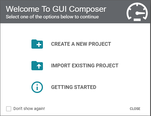
To create a new project, click Create A New Project. This opens the New Project Wizard.
4.1.2. New Project Wizard
The New Project Wizard open when you click Create A New Project in the Welcome Dialog or when Project → New is selected.
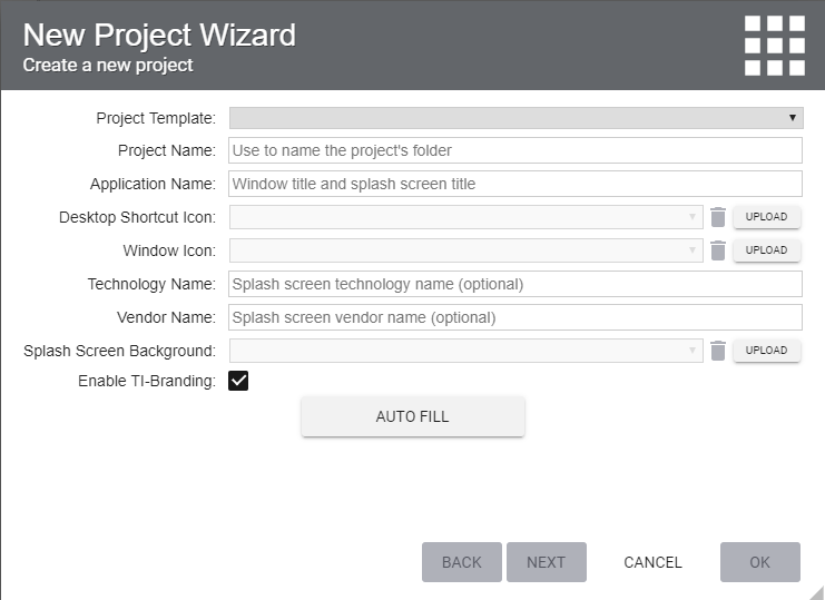
Fig. 4.1 New Project Wizard
New Project Wizard is a multi-step dialog that guides you through creation of GUI Composer Project. The following fields need to be filled in the first step:
Project Template: the template selected contains preconfigured ‘starter files’ that make it easier to create a specific type of project.
Project Name:This will be used as the name of the folder that your project will be stored in. Spaces in this name will be automatically replaced with underscores.
Application Name:This will be used as the window title when your application is running.
Application Icon:This will be used as the icon for that appears in top left corner of your application (Desktop) or icon used for tab (if it will be running in a browser).
Technology Name: General name that could be used to indicate a particular technology, product line or a group of applications. This name will appear in the splash screen
Vendor Name: Company or Group producing an application is running. This string will appear in the splash screen.
Splash screen background: .png or .gif or .jpg image that will be used for the splash screen. It is recommended for the image to support 600x300px, or some multiple of those dimensions. Image will be auto-scaled if it does fall within default range.
4.1.3. Project Templates
The available project templates are:
Dashboard: (v2 Component Library) Recommended for new users and for use on a wide variety of display types (e.g. smart phones, tablets, PCs) due to its use of a relative layout. Tile based widgets work best with this type of layout. This template provides a limited set of widgets but it is easier to get started with.
Application: (v2 Component Library) Allows you to control exactly where components are positioned due to its use of an absolute layout. This option provides full set of widgets available in GUI Composer.
Empty: (v2 Component Library) For expert users, provides a blank project to start with. = Project Zero Demo: (v2 Component Library) A pre-built example project that demonstrates advanced features such as how to use Javascript in your project, graphing variables over time, and controlling target state. Project created with this template is runnable only on MSP430G2 LaunchPad.
Application v3: (v3 Component Library) A complex application template with a pre-defined tab navigation pages for Getting Started, Information, Data and Documentation sections. This template uses Component v3 library.
4.1.4. Autofill
The Autofill button will generate a unique project folder name for you and an application name, based on the Project template you have selected.
Press next, then proceed to Target Programming, target programming is only applicable to v2 projects. If you have selected v3 based project template then please click Ok to close project wizard as target communication is configured by dragging and dropping non-visual (target communication) components from components palette. Please see v3 based tutorials for more information.