5.1. General Use
5.1.1. Using the toolbar
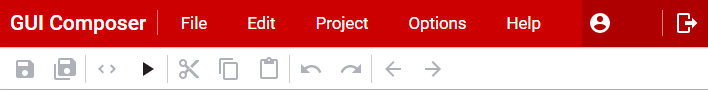
Icon |
Use |
Description |
|---|---|---|
|
Save File |
Saves the currently active edited file on GUI Composer. |
|
Save All |
Saves all opened files on GUI Composer. |
|
Code Editor |
Toggles the code editor display mode. The code editor shows the contents of the index.gui file - i.e. the HTML tags and CSS styling for the web components you are using in your design. Please note that this file is automatically generated by the Composer. You may find that any changes you make in the tag editor are either modified or discarded automatically, so use with caution. |
|
Run |
Run the project as an application. Shows the auto-generated splash screen and will automatically connect with the target, updating the program model bindings automatically. |
|
Cut |
Cuts the selected component(s) or text to the clipboard. |
|
Copy |
Copies the selected component(s) or text to the clipboard. |
|
Paste |
Pastes the clipboard contents into the design. To paste the items into the location specified by the mouse cursor, use the paste menu item in the right-click context menu should be used. |
|
Undo |
Undoes the last action performed. |
|
Redo |
Redoes the last action that was undone. |
|
Select Parent/Child |
Selects the parent or child of the currently selected component. |
|
Files |
Opens the left-side drawer panel,
which shows the files in your
project. Clicking on a file will open
it in the editor in the center. If
the file has a |
|
Component Palette |
Toggles whether the Component Palette pane on the left column of the designer is displayed or not. |
|
Project Outline |
Toggles whether the Project Outline pane on the left column of the designer is displayed or not. On a .gui file, it will show the widget outline in a tree style to show relationships between widget parents/children. |
|
Properties |
Toggles whether the Properties pane on the left column of the designer is displayed or not. On a .gui file, it will show the full properties of a selected component. |
|
Styles |
Toggles whether the Styles pane on the left column of the designer is displayed or not. On a .gui file, it will show the styling of a selected component. |


5.1.2. Editing Files
To view the editable files in your project, open the files view by clicking on the icon at the left edge of the top toolbar. > Double-click on the file you wish to edit and it will open in either the Code Editor (see below) or, if it has a .gui suffix, in the designer view
The code editor supports the following file types:
.js javascript files
.css stylesheet files
.json Javascript Object files
.html files
.txt files
When editing a file in the Code Editor, the GUI Designer menu will include an Edit menu with the following items:
Editor Theme |
Allows you to customize how the editor does syntax coloring and highlighting. Supported themes include Dreamweaver, Eclipse and xcode |
|
Font Size |
Allows you to increase or decrease the size of font used to display text |
|
Wrap Text |
Turns line wrapping on or off |
|
Cut |
Ctrl-X |
Cuts selected text to the clipboard |
Copy |
Ctrl-C |
Copies selected text to the clipboard |
Paste |
Ctrl-V |
Pastes text from the clipboard into the file |
Find |
Ctrl-F |
Search for text |
Replace |
Ctrl-H |
Searches for a user-specified text string and replaces instances with a user-specified text string |
Line |
Ctrl-L |
Go to line |
Undo |
Ctrl-Z |
Undo last action |
Redo |
Ctrl-Y |
Redo last action that was undone |
Other shortcut keys that are supported in the editor:
Ctrl-A |
Selects all text |
Ctrl-Home |
Goes to top of file |
Ctrl-End |
Goes to end of file |
5.1.3. Using Themes
Themes are used to control the look of your project and how the widgets in your project are rendered.
To preview the themes that are available, in the top menu bar select Project -> Design Theme.
The currently active GUI Theme is displayed with a check beside it:
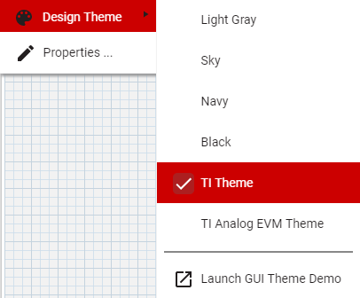
Clicking on the GUI Theme menu item opens up a demo page that shows instances of the paper widgets and ti-widgets as they are rendered using the selected theme. - At the top of the demo, you can select the current theme from the available themes via a drop-down list. - Selecting the theme will affect the preview, run and debug views of your project.
In order to apply the theme for use within the designer canvas you will need to restart the designer
5.1.4. Working with Polymer
Applicable to v2 projects only!
If you need to use Javascript to interact with the components in your design, it will be helpful to understand how the underlying Polymer 1.x infrastructure works. See https:https://www.polymer-project.org/1.0/docs/devguide/feature-overview for more information about how to work with Polymer in Javascript.
5.1.4.1. Other
Pack checker: Verify which Booster Packs are compatible with your LaunchPad.
PinMux: Configure and generate code for your pin configuration based on selected peripherals.